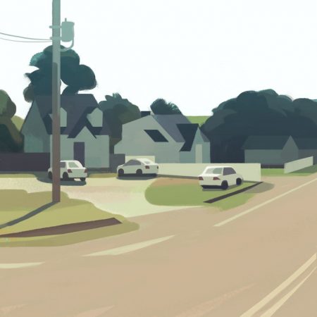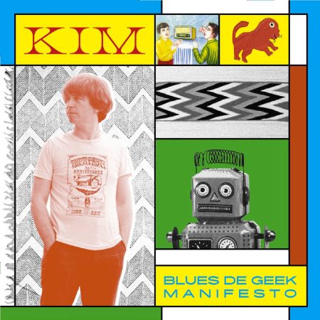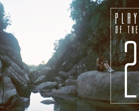
Reduced ressources generate the most creative and disruptive scenery and narrative tricks.
Pia-Mélissa Laroche
ART . February 26th, 2020Before we start, what music shall we listen to while reading?
Surely the one you like… But I can offer you two mixes that I recently made, Rebond and Panorama that I released for Ouïedire.net. It’s a platform created by a friend, with mixes from musicians and also some artists or just music lovers of all kinds.
What’s your favorite thing to draw?
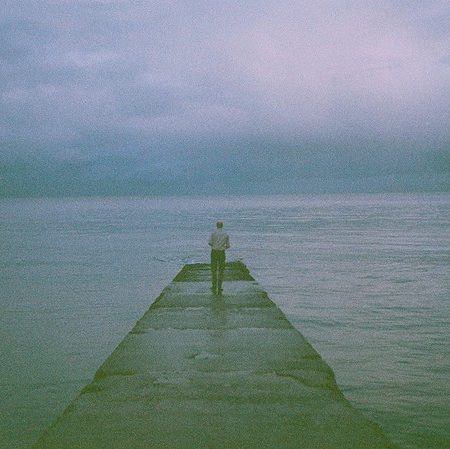
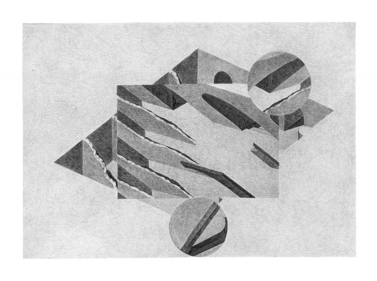
I use to draw architecture, objects or furniture; I was mostly focused on existing things.
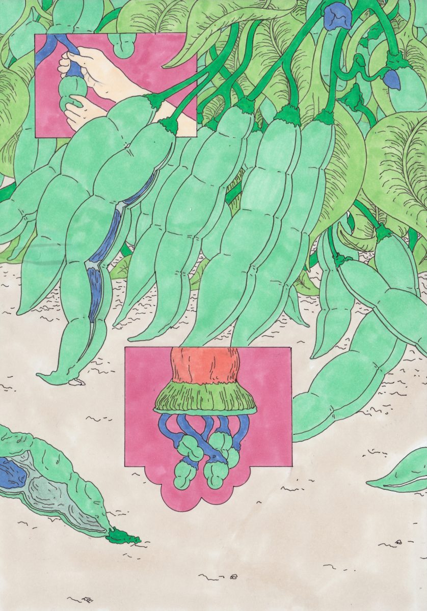
I’ve been drifting away for a while; I draw what comes to my mind, using more or less human, animal or vegetal figures.
That suits me better as it’s much less restrictive.
Where does your aesthetic come from?
It comes from various and dispatched things. I collect pictures on internet or in garage sales, like some graphic design or illustrations from 70’s-80’s.
But my work is mostly based on cinema; B movies in particular.
To me, special effects of all kinds – not only 3D stuff – are always effective even if they are never perfect. Reduced ressources generate the most creative and disruptive scenery and narrative tricks.
The way movies were framed, like Mario bava’s Terrore Nello Spazio or Hercules in the Haunted World, the way a whole atmosphere and universe are set up, influence my illustration choices.
Computer generated images can be also very rich but in a lot of old B movies, due to the impossibility of going further in the realism with special effects the horror or the fantastic aspect being only suggested, more place is left to the viewer’s imagination and interpretation.
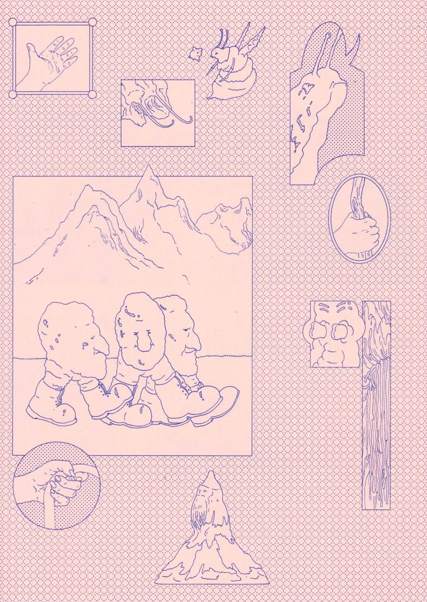
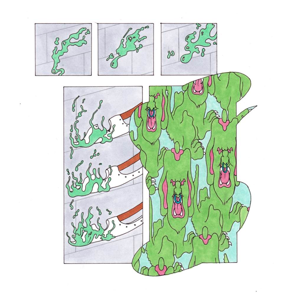
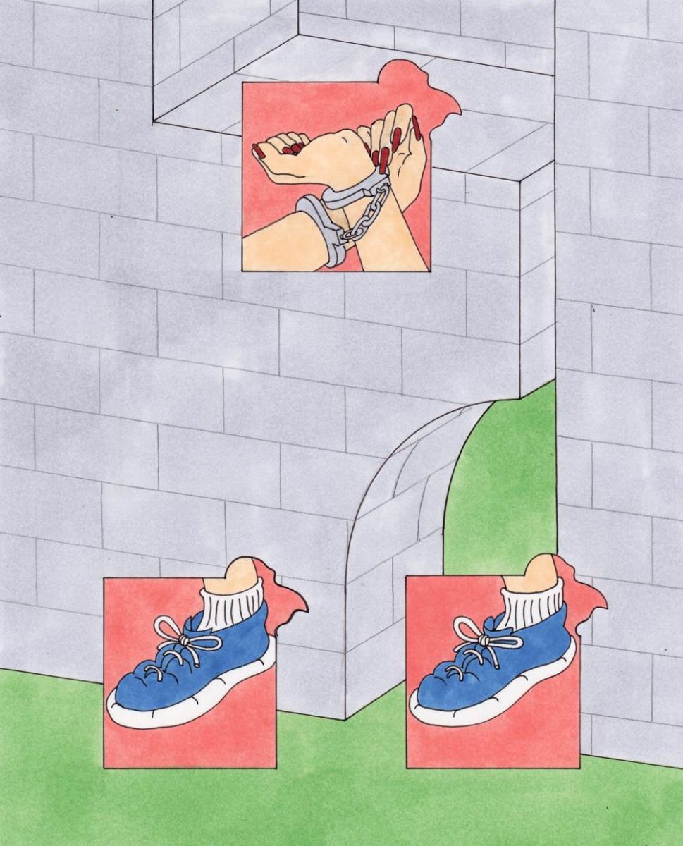
In Dario Argento’s movies, the shots are dark, short or very tightly framed in order not to see the ruses of the shooting. I borrow this trick to draw (like in the one with all the shoes). And all these little visual tricks seems clumsy today but they create an aesthetics that I have never found in movies that using 3D pictures.
But it’s also works with movies like The Carpenter’s Thing where the practical effect is shot in a very frontal way.
So you can take time to appreciate the weirdness of the texture and the way it interact with the actor’s body. The analogy between these pictures and my work isn’t always obvious because it’s not their horrific aspect that mostly interest me. It’s more the direction and the unusual narrative detours that are specific to those movies where decors, accessories or parts of a body have a role to play as much as the actors.
Robert Bresson didn’t make B movies but he’s one of the rare directors i know who puts in his pictures the love of gesture and objects that I care so much about.
By the way, a few years ago I started a blog called Ecran Total that helped me a lot. It’s now also on instagram as @mortegoutte.
Do you share a workspace with other creatives?
I share a studio with 4 artists and authors at the origin of the Cacahuètes editions with who I already had the great pleasure to work.
They propose books and other artworks distributed in peanut dispensers that they deposit in some cafe and cultural places in Paris, for 2€ each.
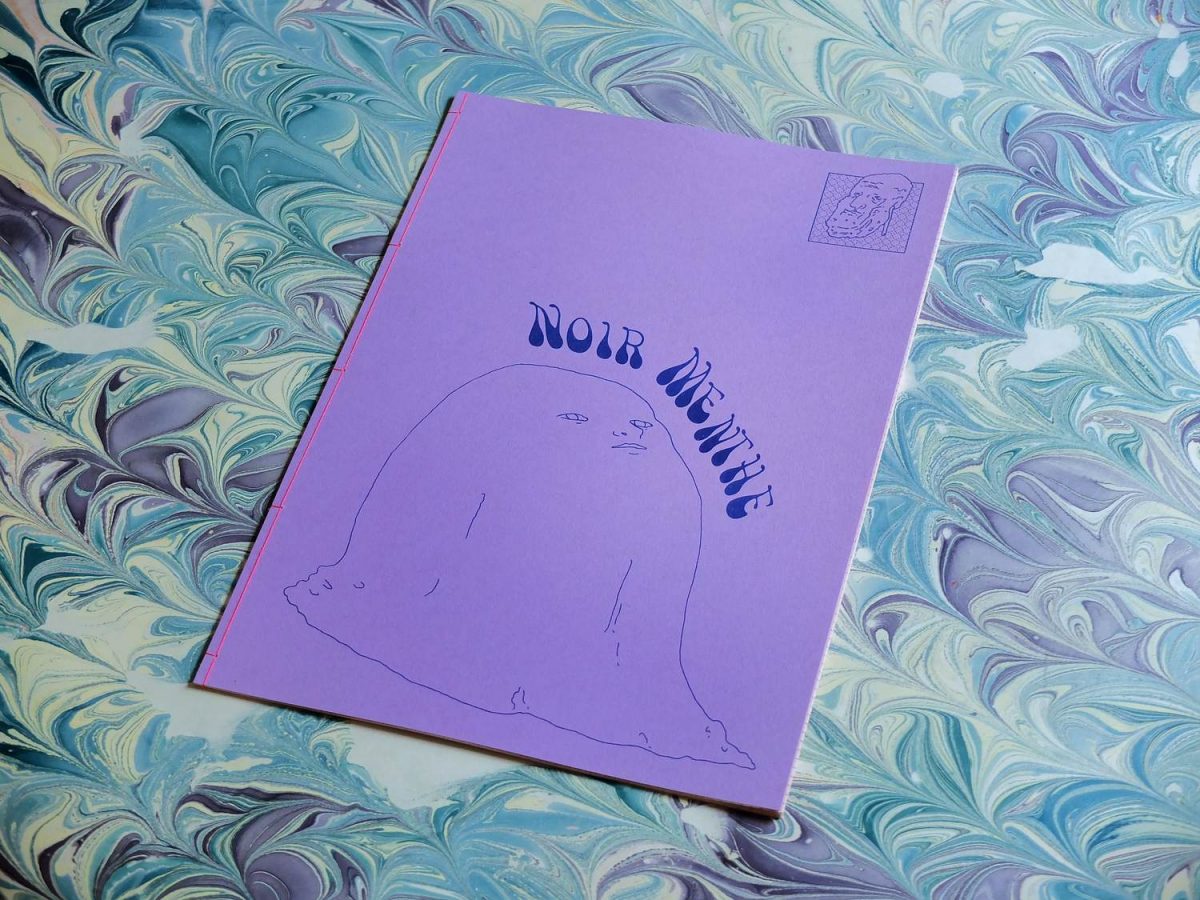
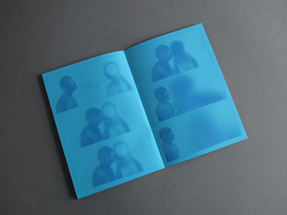
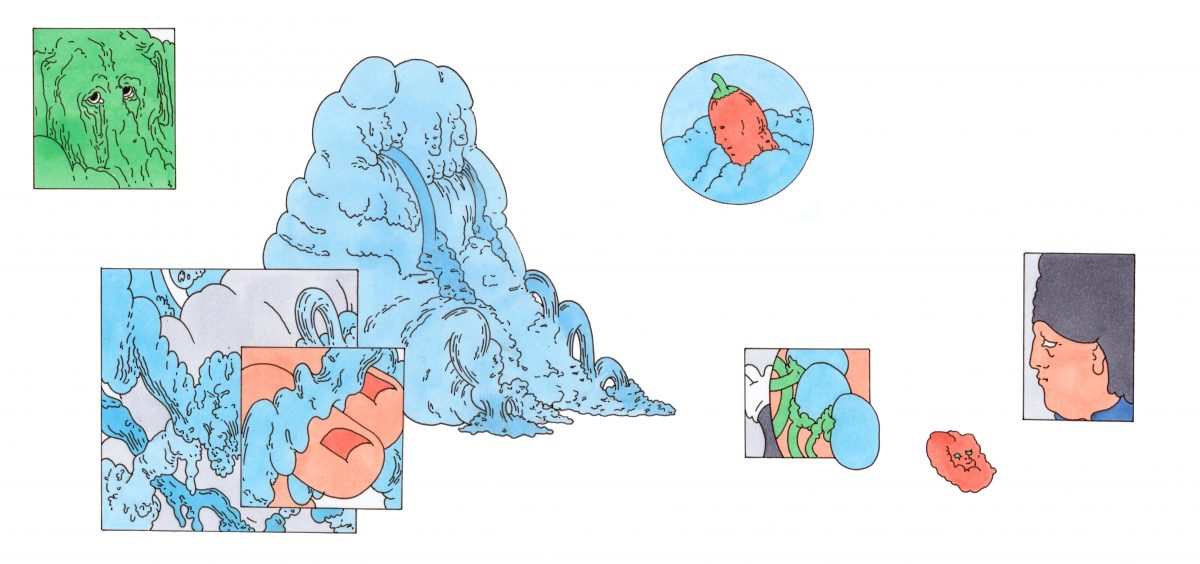
What is Noir Menthe (“Mint Black”) about?
Noir Menthe is a collection of little drawings from my sketchbook that I organized to suggest a very vague narration.
In fact it’s more of a scenery than a narration: a dinner in the Martial Canterel’s villa, eccentric character of Raymond Roussel’s novel Locus Solus. So Noir Menthe is the following of this brilliant and disconcerting story in which the narrator is invited to visit the strange Canterel’s garden.
What was your process for this book?
I wanted to get rid of 500 sheets of a paper’s ream – failed prints from an older project, I wanted to recycle the verso to avoid trashing all of it.
So Noir Menthe is printed on the verso of wasted pages with a Japanese binding.
Pages are fold in two on the side where were printed the older project, bound on the open part in order to seal it and that we can see only the new project.
Most of the time, my book projects are determined by the left overs I have.
Being attentive to a medium characteristics brings up ideas that wouldn’t come up otherwise.
To impose such contraints to myself can be quite reassuring.
How did you get to work with Cold Cube and what’s the story of your comic for that magazine?
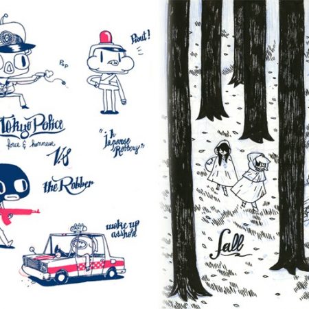
Cold Cube contacted me spontaneously, I didn’t know them but I was very glad. It is a short comic called Vol Sombre (Dark Flight in English), following Inframonde, a Fanzine that I published a year ago. (see below)
The story is about a character selling his sensory organs so he can travel to a promising world but with no possible return.
In Vol Sombre, he wakes up in the heart of the Inframonde.
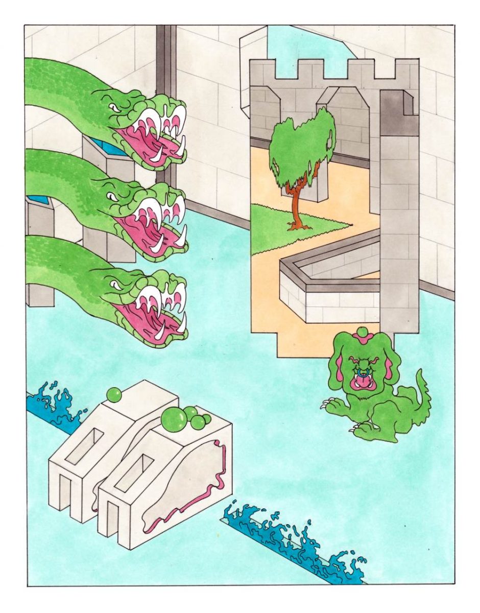
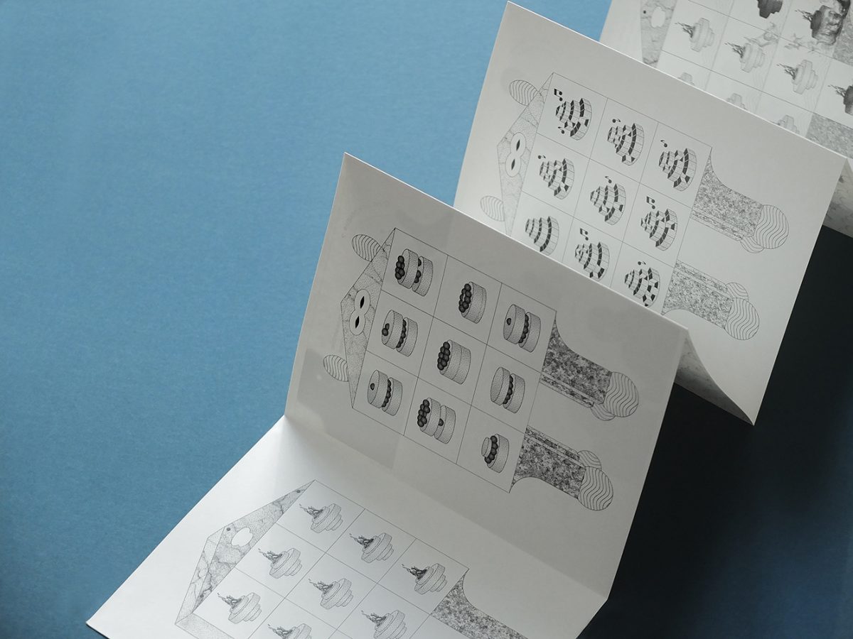
Your project Gageures has something very old-video game like. Were you inspired by these?
I used to play video games, Classic Nintendo and Sega Megadrive as a lot of people of my generation, and I loved that a lot but it’s not what made me do Gageures… Just another bulky medium I wanted to get rid of: a very big map of the french department of Seine-et-Marne – that spent 10 years rolled up in a closet.
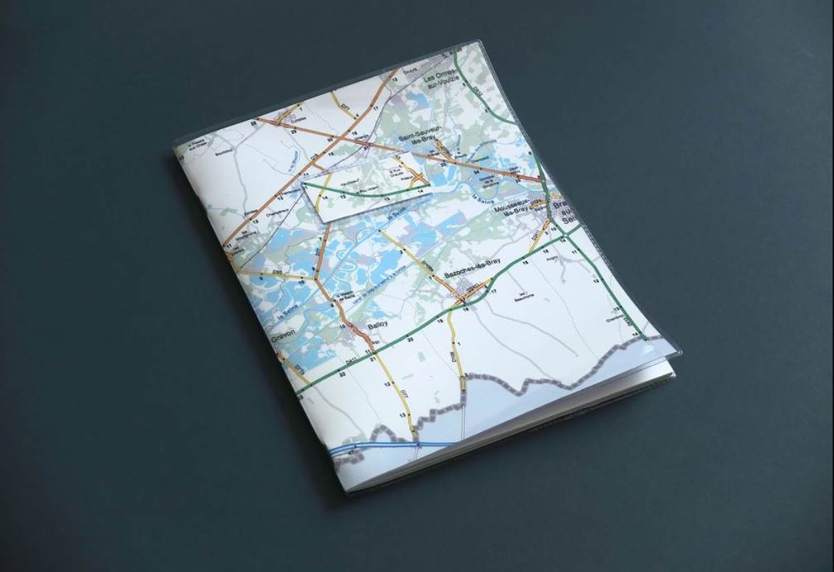
It’s the region were I was born and I remember that quite a few medieval buildings can be found over there, sometimes in ruin. When investigating online I found the digital municipalities’s coats of arms of the Seine-et-Marne’s towns hosted by wikipedia. I wanted to highlight the contrast between the cold and elementary design of those pictures and the noble and disused imagery of medieval castles.
And in a second time the coats of arms’s narrative principles interested me. It tells the history of a city with only some accurate figures, sometimes repeated like a pattern. It’s a very rudimentary narration. They have a precise meaning, scrupulously indexed by our historians I guess, but outside of their context we can imagine all sorts of stories.
Gageures, which means impossible challenge in English, evokes incredible stories taking place in the heart of four medieval domains of Seine-et-Marne.
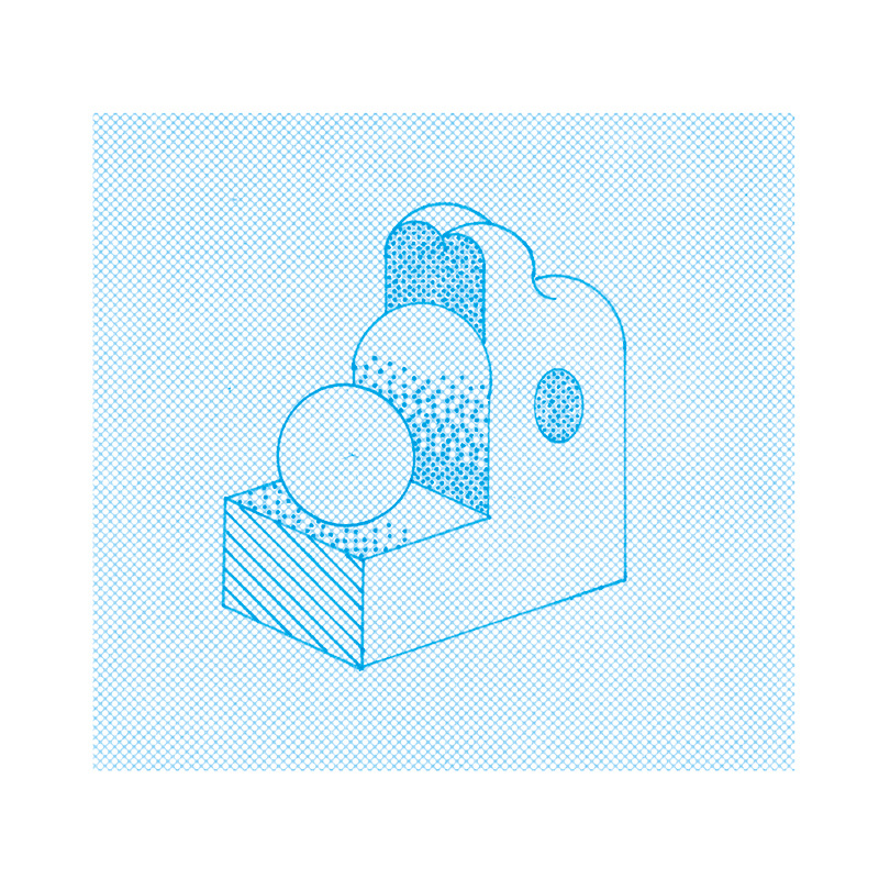
How did you process for the coloring of these series?
I wanted to recover the cold appearance of the Wikipedia’s blazons so I took back my old alcohol markers that we used to use at school to make moodboards.
For a long time, I only used dry tools, such as pencils; the possibility to erase and the absence of color were comforting. Using markers forces me to get ouf this comfort zone, it doesn’t leave room for mistakes. Or let’s say that if you do some, you have no choice but owning it up.
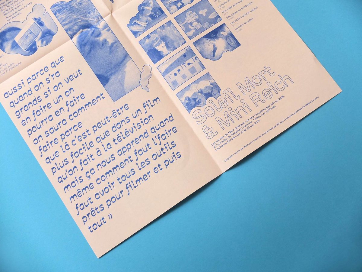
You also have a big interest for layout, like we can see with Soleil Mort & Mini Reich. How are your graphic designer and your illustrator jobs connected? Is there one more important to you than the other?
Indeed i’m a graphic designer and most of the time it’s unfortunately a very institutional and executive work but i need it to live.
Soleil Mort and Mini Reich (Dead Sun and Mini Reich) were released last year for Fanzine Festival! We showed movies made by some children and their elementary school teacher in the 70-80’s.
The friends of mine who found these movies did some research and they managed to meet this retired teacher to talk about about this experiment and I illustrated this interview, to hand it out before the screening, as an introduction to the movies.
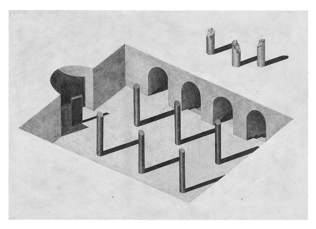
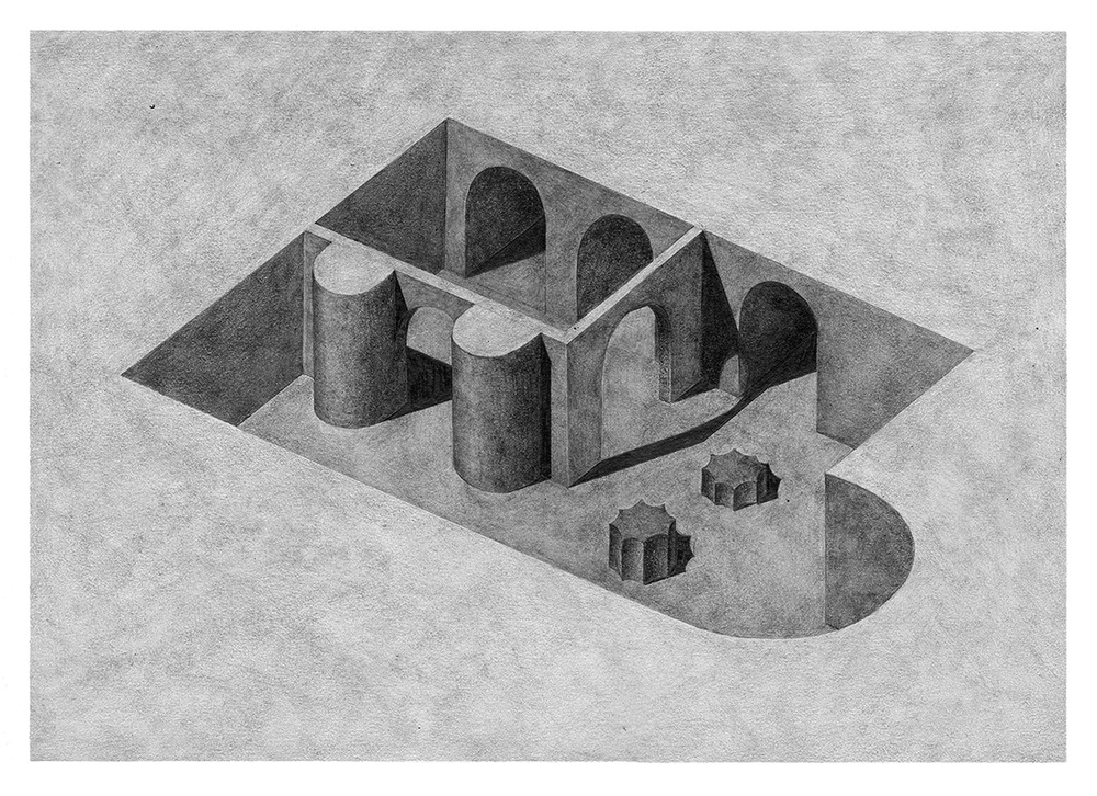
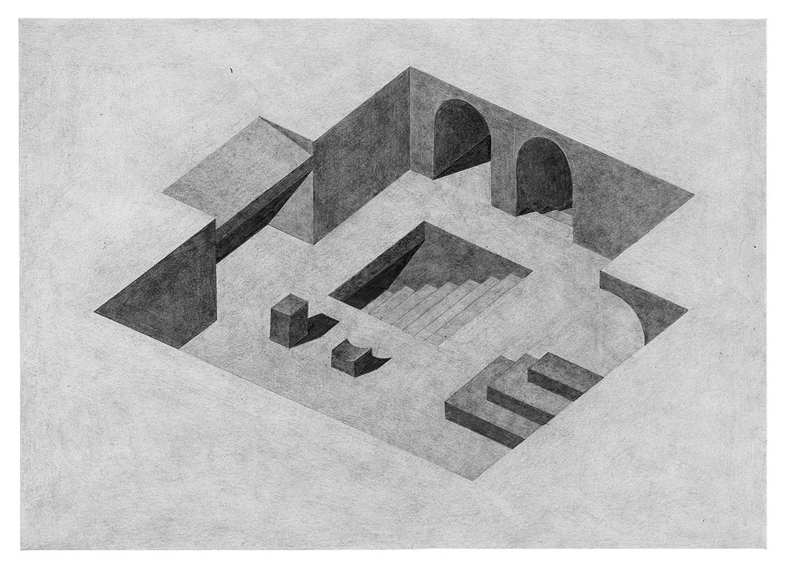
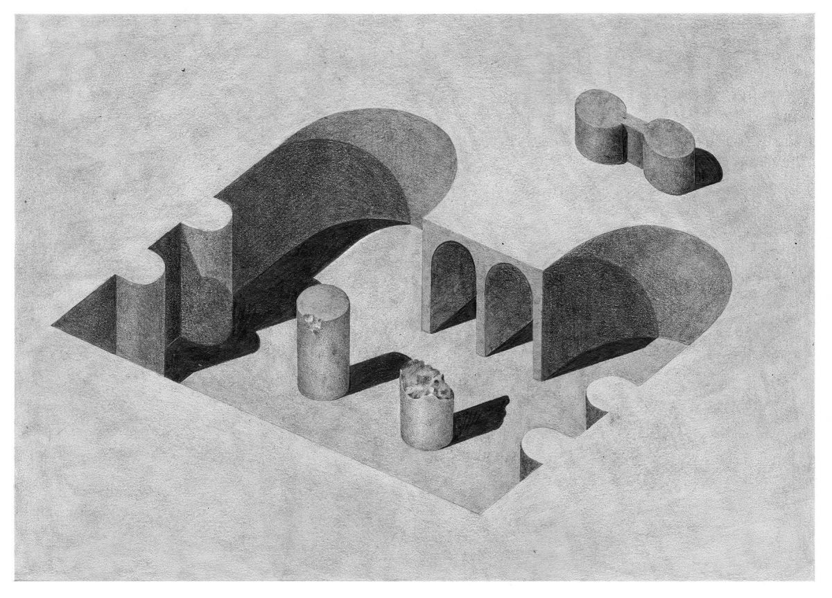
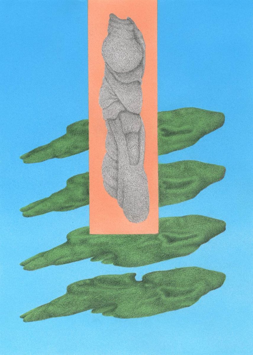
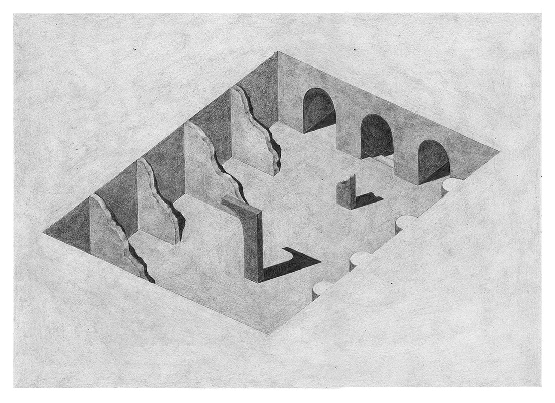
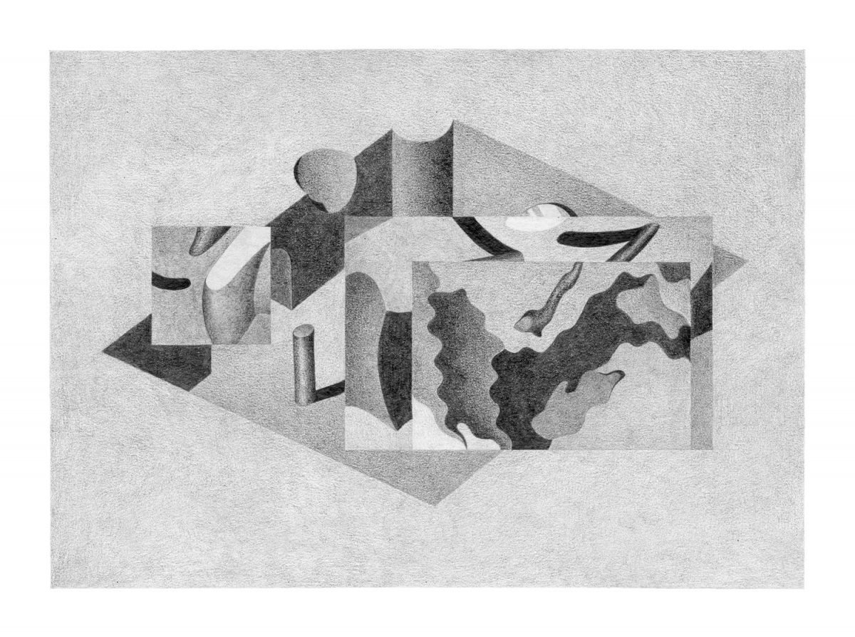
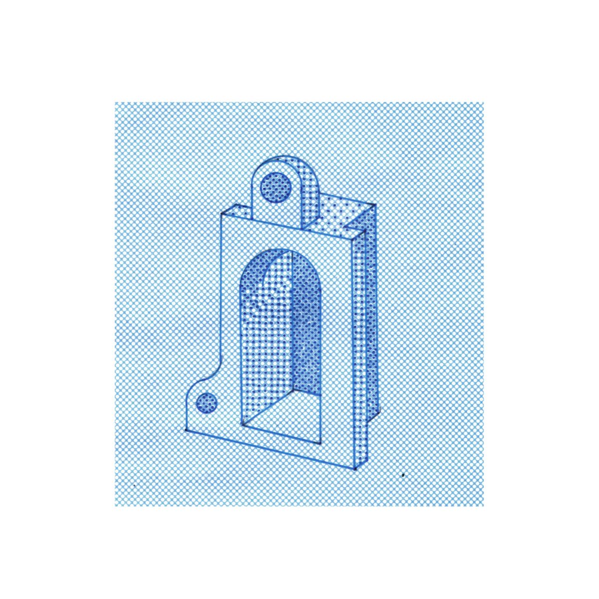
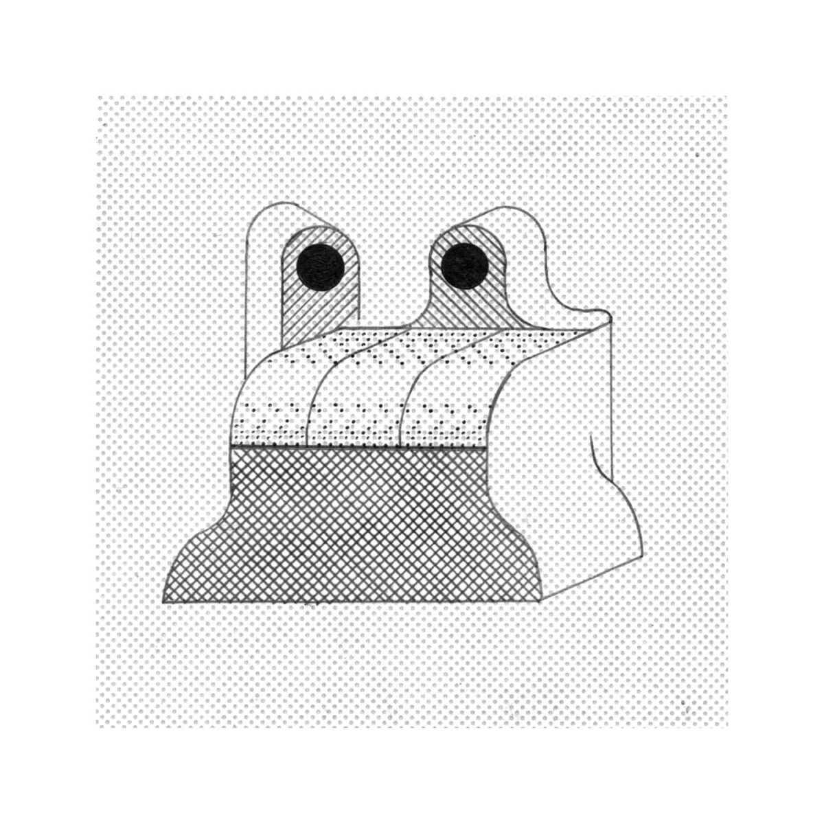
Can you explain us the title of your graphite series “Les Hyperdemeures” (the hyperdwellings)?
To destroy a edifice you have to remove material, leaving free the land on which is stands.The hyperdemeures are dug in the ground and remain open.
So to make them disappear you have to fill the space they’re dug in.
Likes Nabatean’s graves, which a built from raw material found directly on site, nothing is added, everything is subtracted. In french the world demeure means house but it also comes from demeurer : to stay.
Can you share with us some artists that inspire you?
Mario bava, for his living paintings.
Robert Bresson, for the reasons I mentioned above
Lucio Fulci, for the sincerity of its tricks and for its no loopholes and worry images.
Luc Moullet for his ambiguous humor and his keen sense of observation.Maurice Pialat for his acrid tenderness.
Emanuel de Witte for its sacred visits.Carl Theodor Dreyer for the anxious beauty of Vampyr.
Bruce bickford for the abondance of the Protheus’s GardenYuichi Yokoyama for the same reasons as Bresson and the B movies, because with him even elements and passing time also have a full role.
Les éditions matières for their sincerity of their choices and their kindness.

Pia-Mélissa Laroche is a French graphic designer and illustrator. You can check more of her works on her website and on her instagram.