I bought a jacket recently that means I’ve now got a fully white outfit.
Chester Holme
ART . February 18th, 2019What’s your favorite outfit?
I bought a jacket recently that means I’ve now got a fully white outfit which I find really funny and have been wearing around the house a lot. It’s not had many trips outside though, as I’m pretty certain that the moment I do, my dog will knock me into a puddle or jump on me with muddy paws.
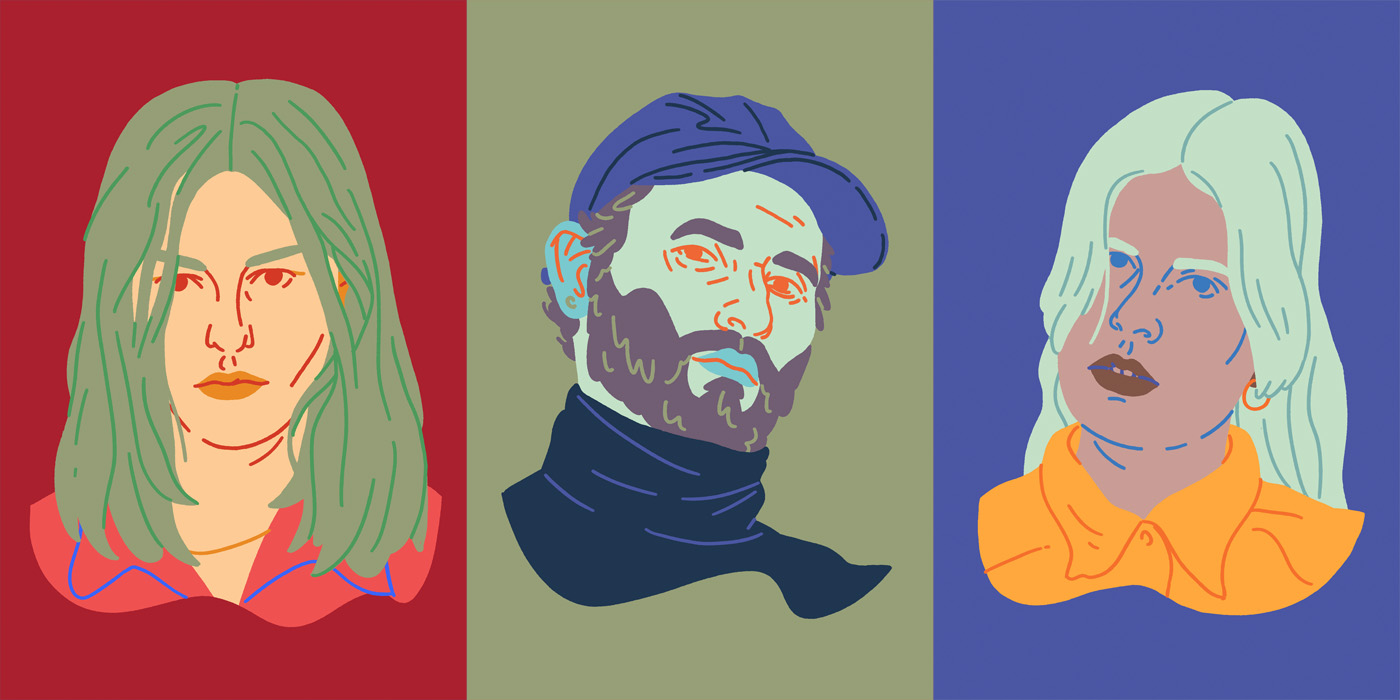
Self-portrait that Chester drew for us with that particular outfit
Who are you Chester?
I’m an illustrator and some-time maker of other things from London.
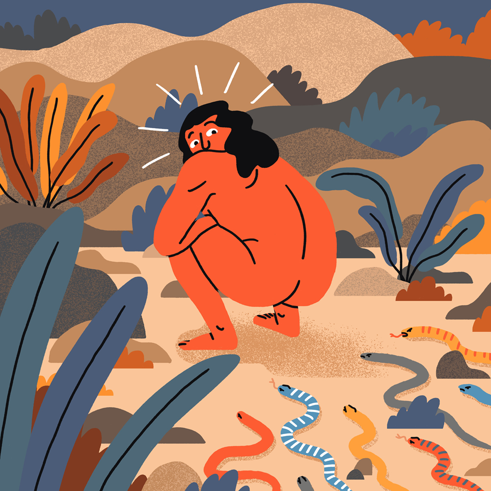
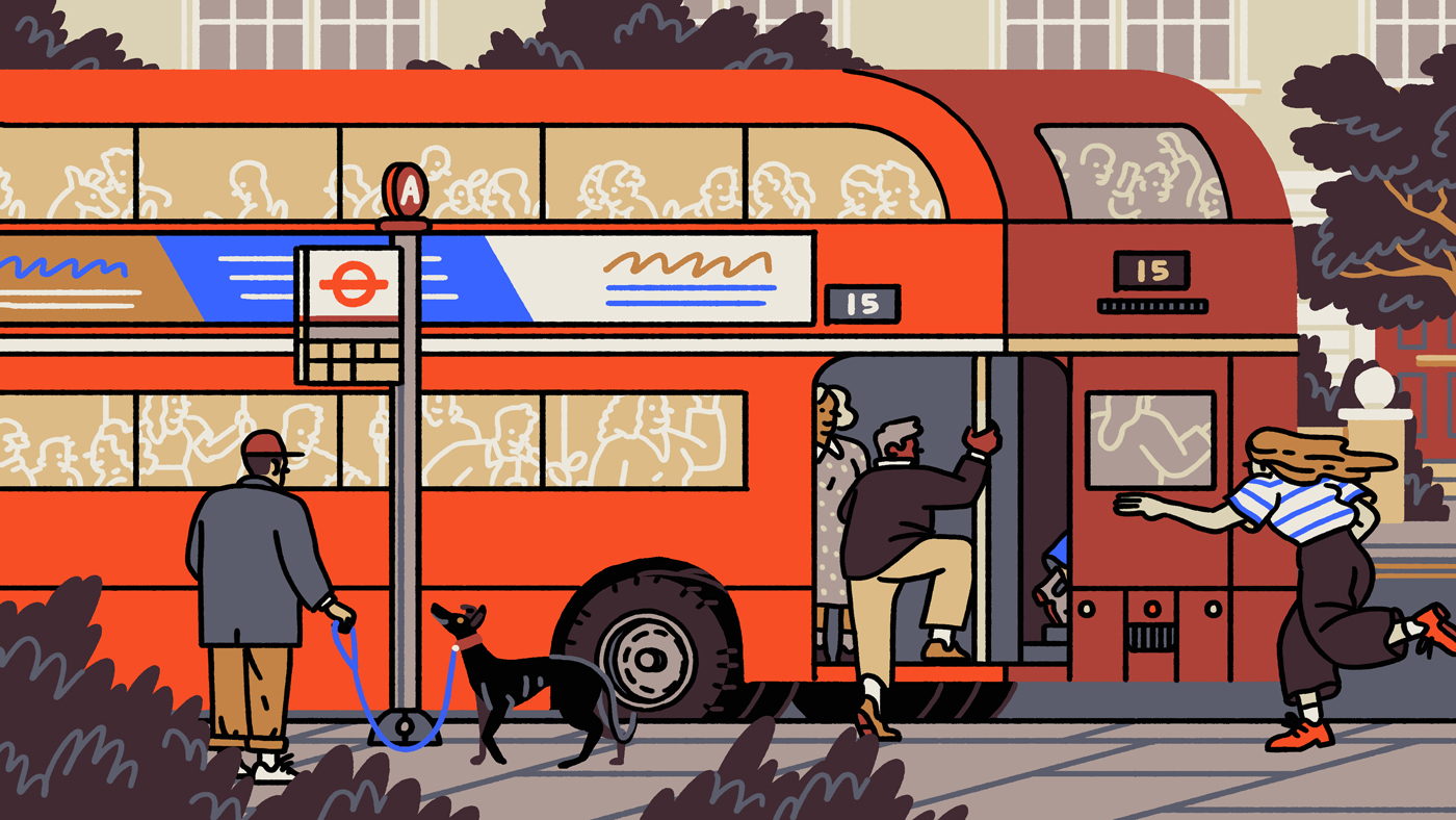
Do you know how did you get your current visual style? Where these bold, thick lines come from?
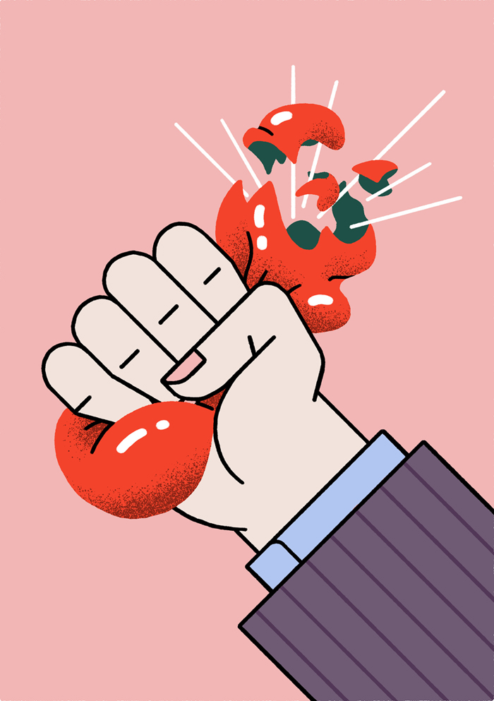
I’m really prone to over-drawing — putting too much down on the page and drowning the image in visual noise, and so I think using a single thick line-weight came about as a way of deliberately restricting the amount of marks I could make. It forces me to be smarter and more deliberate in how I draw and I’ve come to really enjoy the more rigorous process it requires.
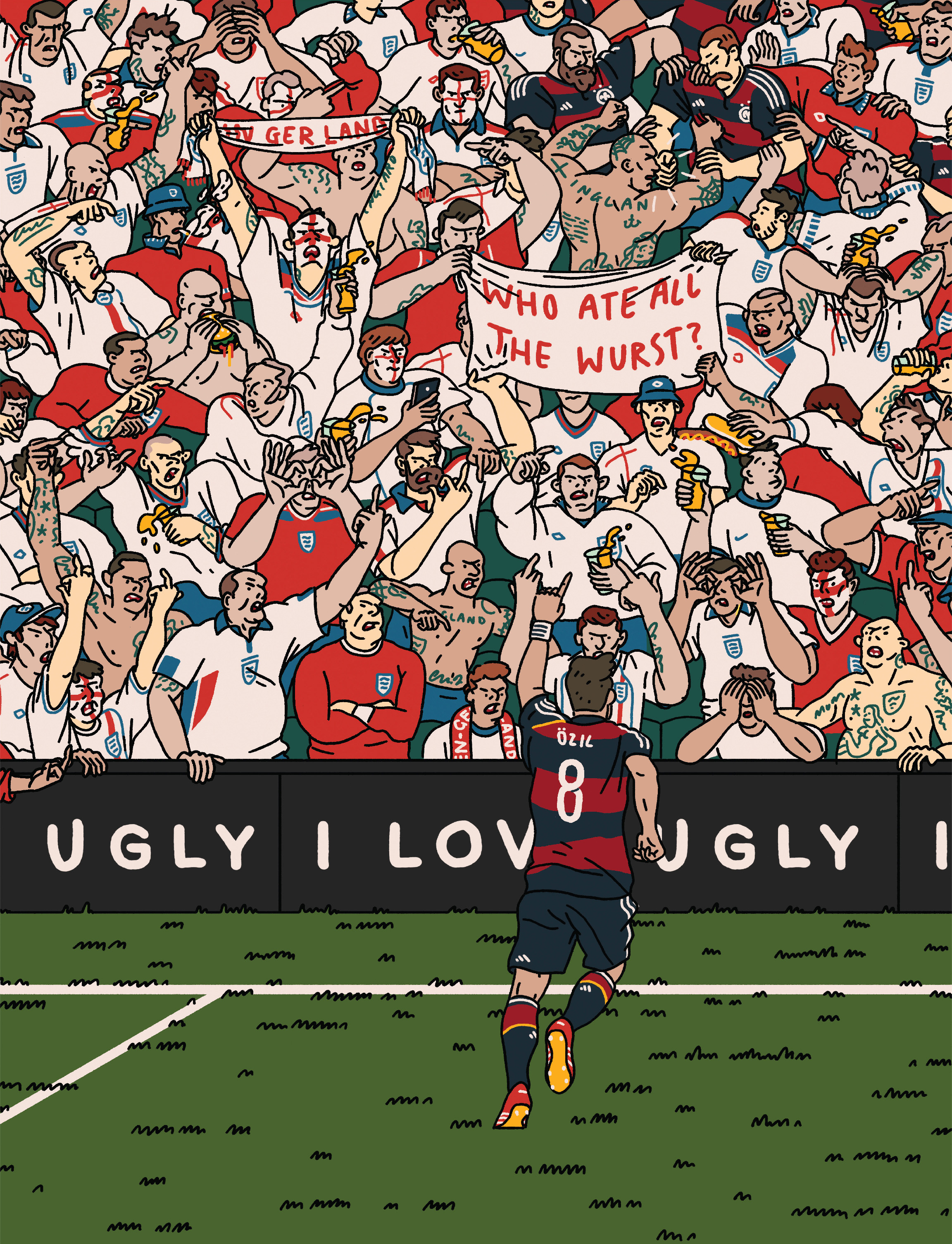
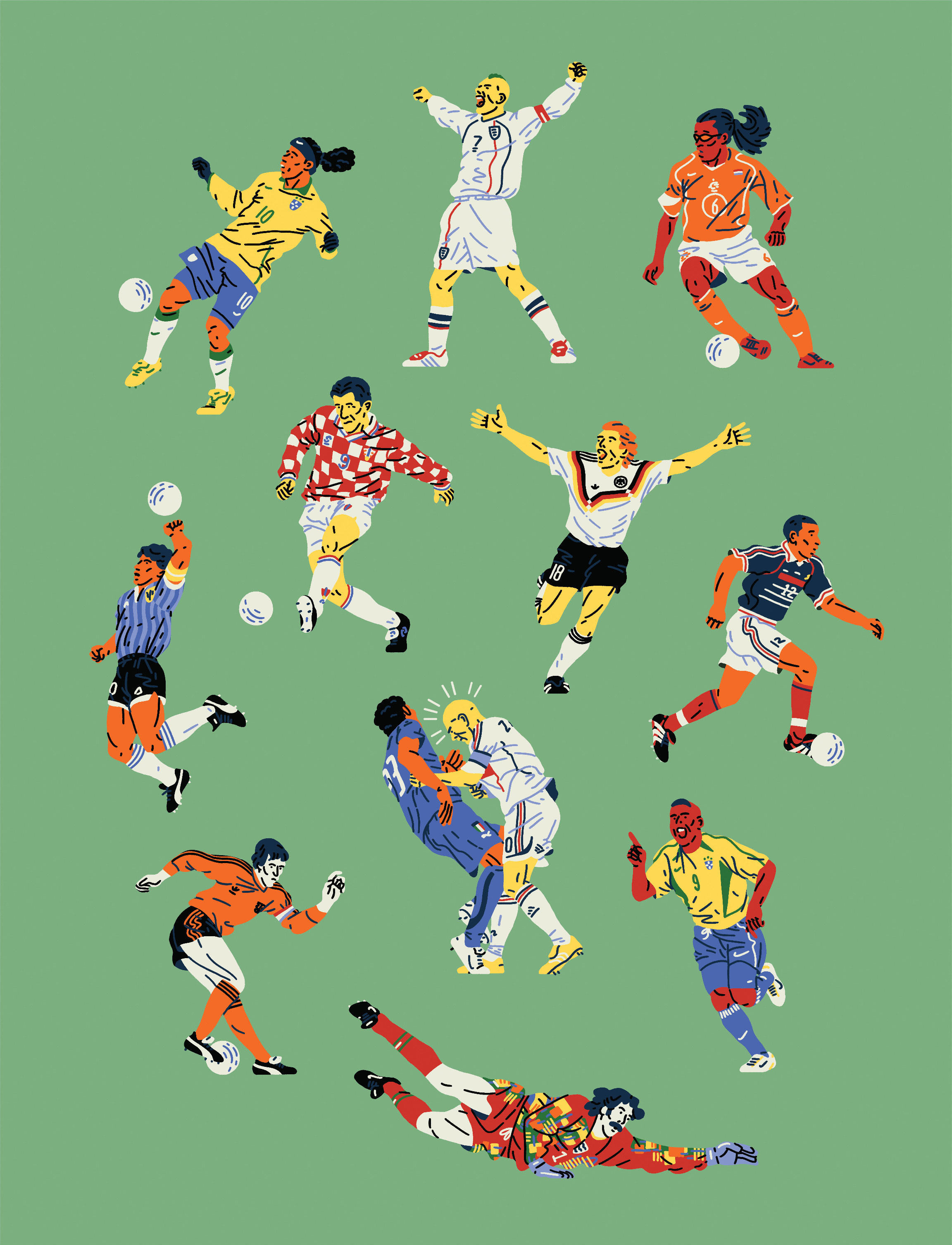
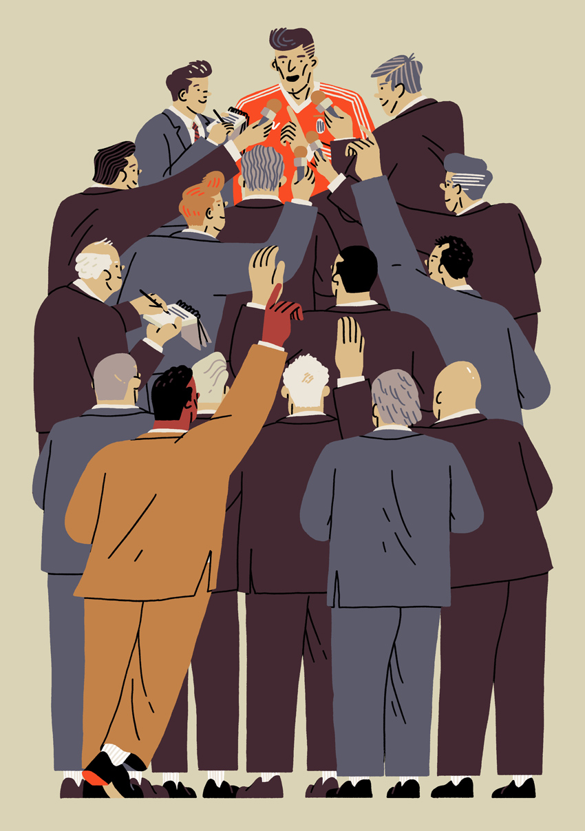
You draw a lot of Sport-themed illustrations and we love the energy you put in them. Are you passionate about sports or is it just because of the client commissions you get?
I am pretty obsessed with sport, but the vast majority of football stuff I’ve made in particular has been commissioned. I do think that despite not necessarily feeling a compulsion to make work about it, I’m able to draw on my experiences as a fan which hopefully translates into a nice energy in those pieces. I’d like to think that sports fans who come across those bits of my work get the sense that they were made with an insider perspective.
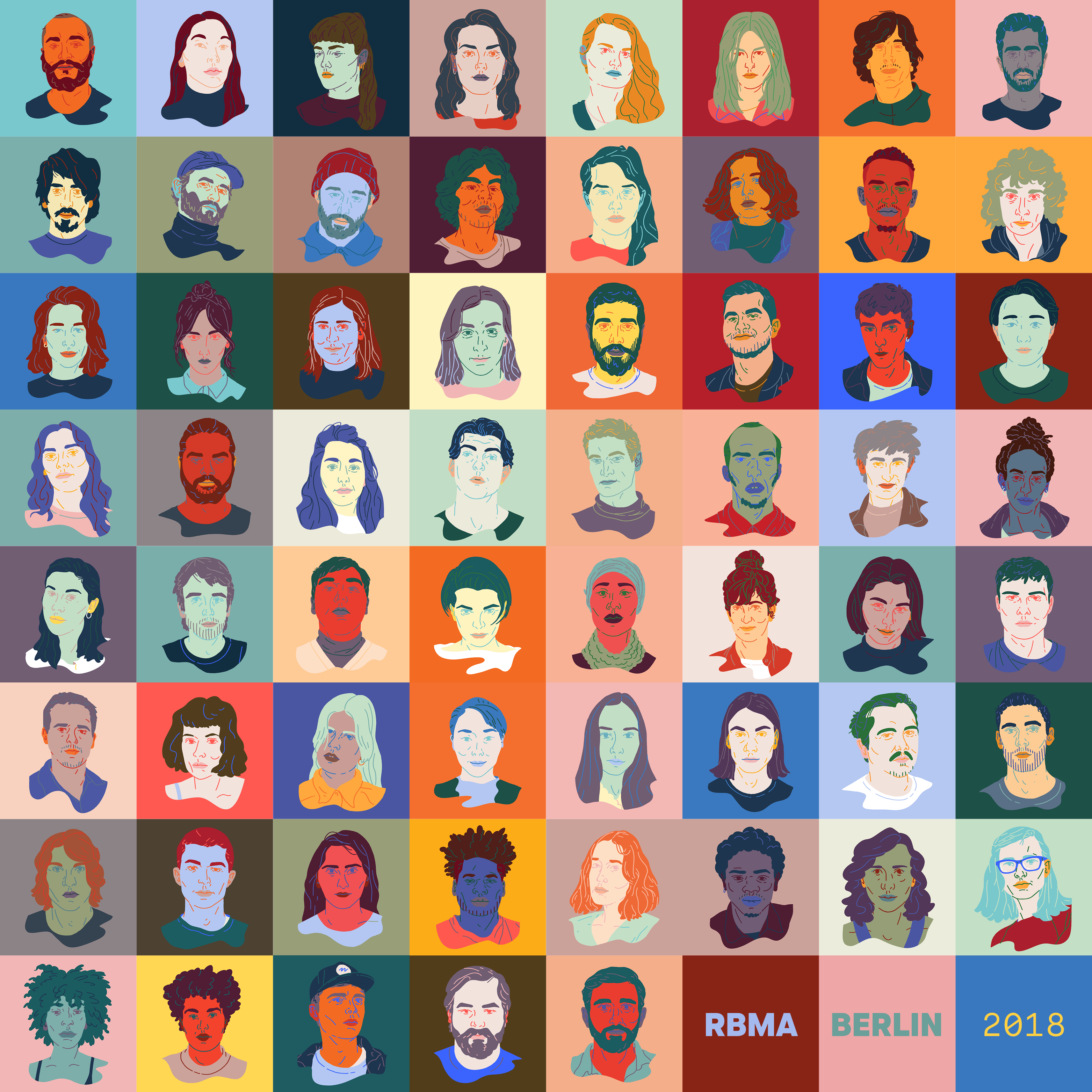
From the past year, which piece are you the most proud of and why?
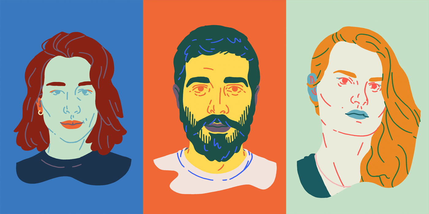
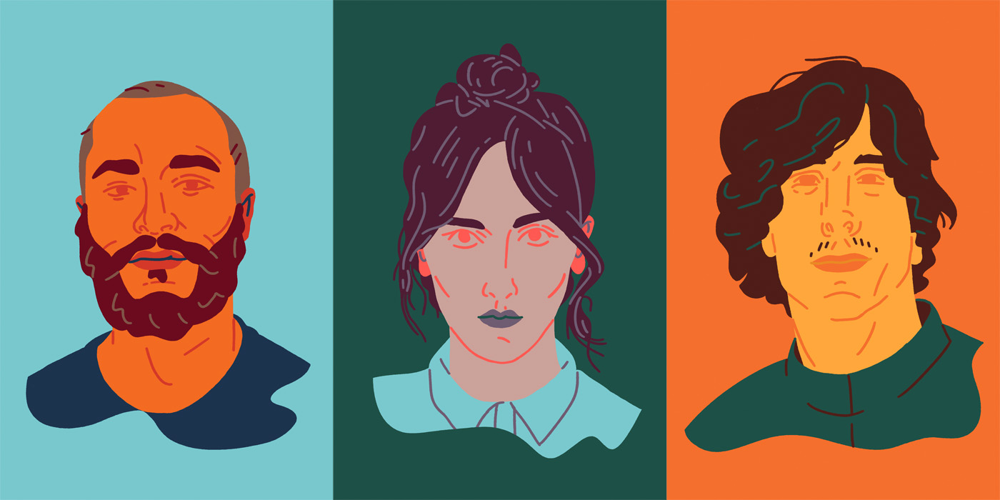
I’m pretty pleased with the portraits I was asked to make of the Red Bull music academy 2018 participants early last year. It was a big undertaking — I think it was something like 65 portraits that had to be done in a couple of weeks — and not something that I’d ever had any real experience with, so it was a bit of an overwhelming brief to receive initially. Despite that though, I felt I worked really consistently and produced a solid body of work. I was particularly happy with how the colours came together and was pleasantly surprised by some of the likenesses I managed to capture. I also got quite a few nice messages from the musicians who I’d drawn, which is always a sign that you’ve done a good job!
Could you guide through the creative process behind it?
The first thing I wanted to do, was to establish a really strong colour palette that would allow me to produce a large number of illustrations that felt characterful and unique to the individual musicians they depicted, but that at the same time worked together as a collection and felt related. I then had to gather reference to draw from (all I’d been provided with was the images that were included in their RBMA applications, which meant I had a single photo and a passport image of each subject, not really enough to produce an illustration that felt personal!) which was a kind of funny process, I felt like a bit of a stalker going through all their instagrams and stuff!
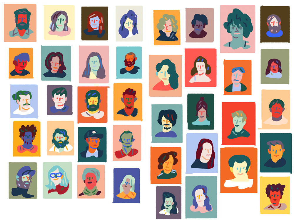
Development sketches for the RBMA project
I worked up a tiny stamp sized rough for each person, where I worked out composition and the particular colours I wanted to use in each instance, and then got my head down and powered through the final illustrations. The majority of them got signed off first time round, but a few revisions did come back — make her look less angry, you’ve forgotten to give him eyebrows, etc.
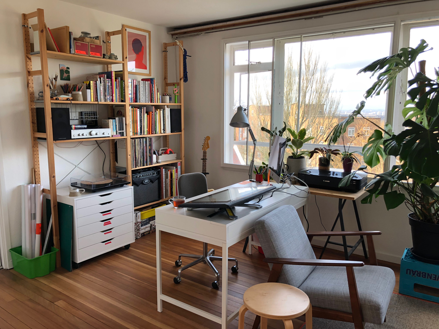 Chester’s studio
In your recent works, you represent facial expressions and complex body positions with a lot of precision and yet very little details.
We see a clear evolution compared to what you were doing few years ago. How did you achieve that?
I think just a lot of trial and error really. I’ve never really thought of myself as particularly good at drawing, but I hold my work to quite a high standard, so I tend to draw and redraw poses and expressions over and over again until they’re right. I’ve also been using a Cintiq for the last year or two, which I has definitely had a big impact on the quality of drawing I’ve been able to produce digitally. It’s loosened up my linework, which I think has led to a greater fluidity in the characters I’m drawing.
What are you listening to when you work?
It depends on the kind of work i’m doing. I’ll listen to music when I’m writing stuff (like this) or doing emails or working through ideas and compositions in the early stages of a project. Right now I’m listening to Orelsan’s album La fete est finie. I don’t speak french, but it reminds me of The Streets and I’m into it. Some other bits I’ve been enjoying recently are Nite Flights by the Walker Brothers, Jassbusters by Connan Mockasin, Jesse Gannon’s new album, and James Blake’s new album.
I find that when I know what I’m doing with an illustration and I just need to get it down on the page, I tend to switch to listening to podcasts and audiobooks to occupy my mind and keep me at my desk. My top podcast recco’s at the moment are Off Menu with Ed Gamble and James Acaster, Blood and Mud (A rugby podcast, seeing as the six nations are going on right now), and Lore. I’m also a real sucker for a detective novel, my current favourites are the Harry Bosch books.
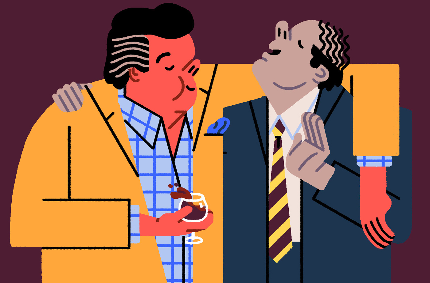
Your color choices are always right on point and yet you associate colors that are usually not used together.
How do you come up with these palettes?
Again, I think it’s just a lot of trial and error really. Colour is definitely something I really struggled with early on, but I’m feeling more and more in control of now. I try to keep my eyes open to find interesting uses of colours as much as I can, and I’ve built palettes around colour combinations I’ve seen in newspaper photos, films, supermarket shelves and shop fronts. I’m currently very into pairing a number of muddy, dirty tones or greyed out, pastel tones with a single really bright, super saturated colour. I’ve got a little book called ‘A Dictionary of Color Combinations’ which is amazing, and if I’m struggling I always tend to find something I can use in there.
My biggest inspiration for colours is the illustrator Sara Andreasson who I think just has the best eye for picking a palette (so much so that I sometimes have to stop myself from looking at her work so I don’t end up poorly ripping it off in my own illustrations).
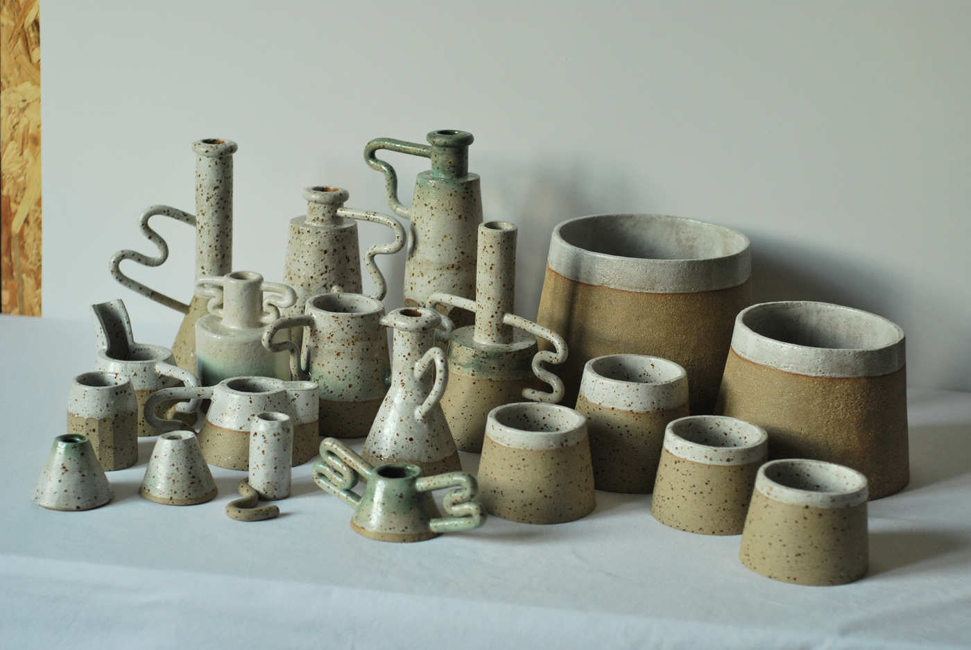
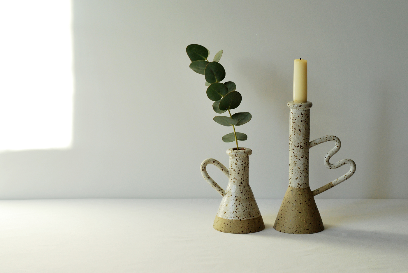
Do you have new ceramics coming? Can you tell us more about this side activity and how satisfying this must be? :)
Ah man, yeah I really need to start that again. I’ve actually only just started freelancing full time. For the last couple of years I’ve been combining doing illustration with working in a coffee shop, which left me very little time to do my own work in. My resolution was to make time to do more of that this year, so hopefully I will have some new ceramics coming soon.
It is really satisfying, especially when pretty much everything else I make is on a computer. Sitting down with a lump of mud and turning it into something else that grows in front of your eyes is a very physical and immediate process, and a really nice contrast to drawing. Not the best in the dead of winter though, cold hands!
What’s next for you?
This time of the year always seems to be a bit slow for me in terms of client work, so I’m doing a few bits of personal work at the moment. I’m building myself a new website and online shop, and in doing so I’m having a bit of a rethink about the kind of things I want to sell online. I’m currently having a nice time putting together some ideas for potential new prints and maybe some other products too. I’m also planning some stuff to release around the launch of a book I’ve illustrated for NotOnSunday, which is exciting.
What are you going to do just after having answered to this final question?
Check on dinner. Lasagne!
Chester Holme is a British illustrator based in London – you can find his work on instagram or on his website.